From three design systems to one: our migration to shadcn/ui
What we'd tell anyone about to attempt the same thing.

Eighteen months ago, a Thrive engineer starting a new feature had to answer a question before writing any of it: which button do I use?
There were three plausible answers. You could reach for our original homegrown component library, built years earlier but showing its age. You could use our newer components built on Material UI, an off-the-shelf library we'd started adopting but never fully rolled out. Or you could do what plenty of engineers on a deadline had done before you: build a one-off component in your feature folder and add a fourth answer to the pile.
The effects added up. Thrive serves millions of learners across mobile, desktop and tablet, and the product didn't quite feel like one product. Buttons, modals and forms looked subtly different depending on which corner of the platform you were in, and every piece of UI work started with digging around to see what already existed. What our designers created kept drifting away from what shipped, because the thing they designed with and the thing we built with weren't the same system.
None of the three systems was a bad idea. Each was a reasonable attempt to solve the problem left by the one before it, and each stalled the same way: priorities shifted, the migration stopped halfway, and the codebase gained one more generation of components. Each attempt then failed because nobody was made to finish it. So when we started the third attempt in January 2025, the plan for finishing mattered as much as the choice of technology.
What shadcn/ui is, and why we picked it
If you're not a frontend engineer, here's the short version.
Most component libraries are dependencies: you install them, and the components live inside a package you don't control. When you need a component to behave differently from what the library envisioned (and with a product as customisable as Thrive, you always do), you end up wrapping it and overriding its styles. A lot of our Material UI code was layers of overrides trying to make Material UI look like Thrive.
shadcn/ui takes a different approach: Instead of installing a package, you copy the actual component code into your own project. It’s then yours to keep and edit. Under the hood, it relies on two things – Radix, which handles fiddly details like keyboard navigation and accessibility so you don’t have to build them from scratch, and Tailwind CSS for the visual styling. If you ever need a component to behave differently, you just open its file and edit it directly.
To be completely honest, shadcn and Material UI are functionally more similar than different. What sold us was the ownership. After being burned by half-adopting other people's systems, we wanted a design system that was fully ours, shaped to Thrive's product, with no upstream library to fight and no excuse to leave the migration half-done.
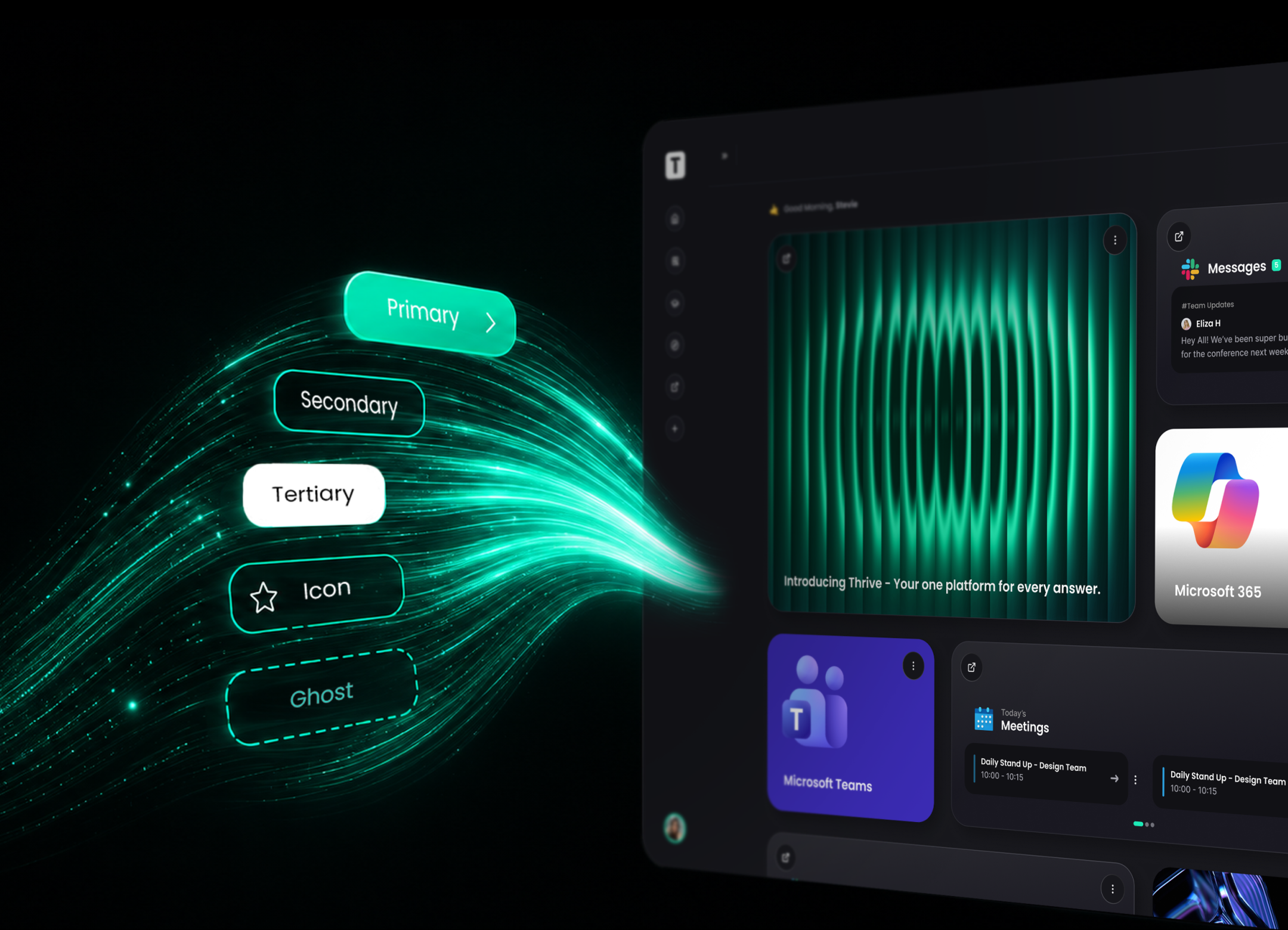
Our button today is a single file we own, with every variant declared in one place:
const buttonVariants = cva("inline-flex items-center justify-center …", {
  variants: {
    variant: {
      default: "bg-primary text-primary-foreground hover:bg-primary/90",
      brand: "bg-thrive-green text-thrive-green-foreground …",
      destructive: "bg-destructive text-destructive-foreground …",
      outline: "border border-border bg-background hover:bg-accent …",
      // …and so on, all in one file we own
    },
  },
});
When the design team wants a new variant, it's a small addition to that file.
The migration: strangler fig, not big bang
The riskiest way to replace a design system is the big-bang rewrite. That entails freezing the product, rebuilding everything, and hoping you land before the business notices. We did the opposite, using what's often called the strangler fig approach: build the new system around the old one until nothing depends on the old one any more.
This is the part that made the difference, more than any framework choice. Three rules, actually enforced:
- All new work uses the new system, from day one. No exceptions. The pile of legacy UI stopped growing the day the new library landed.
- Teams that touched an old screen were required to migrate it. High-traffic areas were prioritised, and long-tail screens waited their turn.
- The old systems stay fully functional until the moment they're deleted. No half-broken transition states for learners.
For a long stretch, Material UI and Tailwind coexisted in the same app. They were two styling approaches with different opinions about global styles, resets and theming, running on the same pages.
We had to bridge our brand theming across both worlds so that a half-migrated screen still looked coherent, which meant mapping Thrive's design tokens (the colours, spacing and typography that define our brand) onto the CSS variables the new system runs on. As a nice side effect, dark and light mode now work consistently across the platform, because a theme is just a different set of variable values.
And because Thrive serves learners in right-to-left languages, every new component had to meet the bar the old ones set. We build to WCAG 2.2 AA and audit against it, so a new component had to hold that standard for contrast, keyboard navigation and screen readers before it could replace an old one. Building on Radix helped a lot here, and we baked RTL handling into the primitives themselves.
The change that made it feel real was the data tables. There were tables all over the platform, each with its own pagination, sorting and spacing. We built one table and one pagination pattern in the new library and moved everything onto them. For the first time, every table on the platform behaved the same way.
Designers and engineers on the same page
Before, design drift happened simply because designers couldn't easily see what actually existed in code, so Figma and production slowly diverged. Storybook fixed most of that. The library ships with over 120 stories covering every component, variant and state, browsable by anyone, and new or changed components get reviewed there. Designers and engineers now work from one set of component names, variants and tokens, and everyone can see it.
Where we landed
Eighteen months in:
- One design system. Around 70 core primitives with roughly 100 product components composed on top.
- The old libraries are gone or going. Imports of our previous component kit: zero. Material UI is down to its last few dozen files.
- It was a collective effort. Around 670 commits to the new library from more than 50 engineers across the whole engineering org.
- Features ship faster. New UI starts from composition: grab components, assemble, ship.
- The product looks like one product, with accessibility and RTL built into the primitives.
If you're staring at your own three design systems
The process matters more than the framework. shadcn served us well, but the migration succeeded because of the rules around it: the new system was mandatory for new work, touching an old screen meant migrating it, and we held that line for eighteen months. Our previous two design systems had no such rules, and no library choice would have saved them.
Owning your components removes the friction. Copying components into your repo sounds like a shortcut next to a versioned dependency, but it means you never fight an upstream library's assumptions, and there's nothing external to blame when adoption stalls.
Expect an ugly middle. Two styling systems will coexist for a while, and it will bother you. It's still better than a big-bang rewrite, and far better than not starting.
Finish the job. An unfinished migration leaves you with one more design system than you started with. Track the burndown, celebrate deletions, and drive it to zero.
What's next
The migration gave us a foundation to build on. Next up is motion: a set of animation principles to bring the same consistency to how the platform moves. Colours and components will keep getting uplifted as the design system evolves. That's a future post.